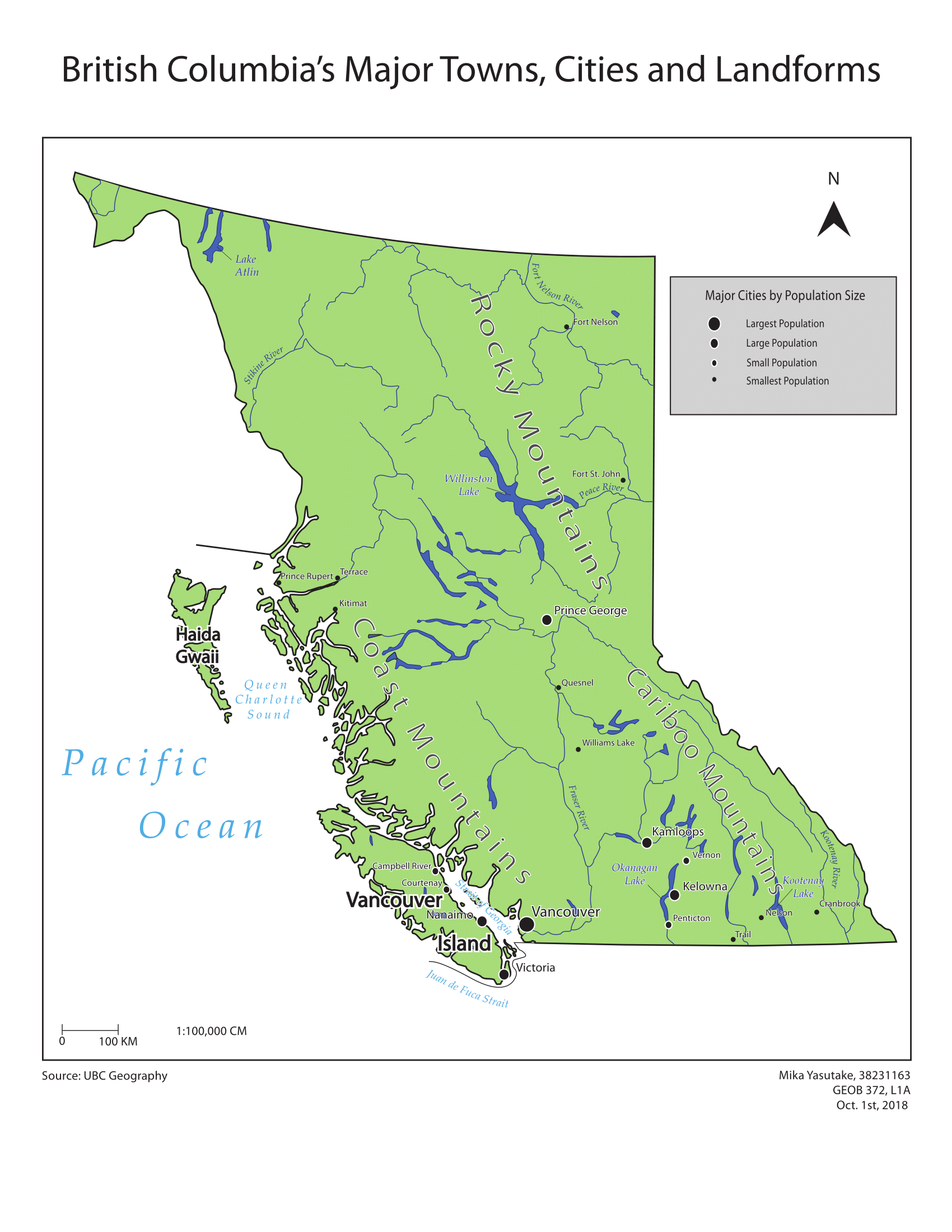
This week, I have made a reference map of the major towns, cities, and landforms of British Columbia. A key challenge that I faced was fitting all the necessary labels without compromising the map's visual communication through congestion and overlapping labels.
HERE ARE SOME SKILLS I PICKED UP ALONG THE WAY:
- Designed a reference map of BC's towns, cities and physical landforms using cartographic conventions and Adobe Illustrator software
- Deployed halos to keep labels legible and adequately positioned in terms of visual hierarchy
- Created proportional symbols to reflect relative population sizes from largest to smallest cities
HERE ARE SOME CARTOGRAPHIC CONVENTIONS CONCERNING TYPE AND TEXT PLACEMENTS:
- Feature labels should be exaggerated to show the complete extent and orientation of the feature
- Coastal and terrestrial features can be differentiated by labelling coastal features to one side of a symbol, while labeling terrestrial features to another side
- Type sizes should never go below size six (even this seemed a bit small to me!)
- Labels of the same feature should always be made with the same type family, while size may be used to show hierarchy