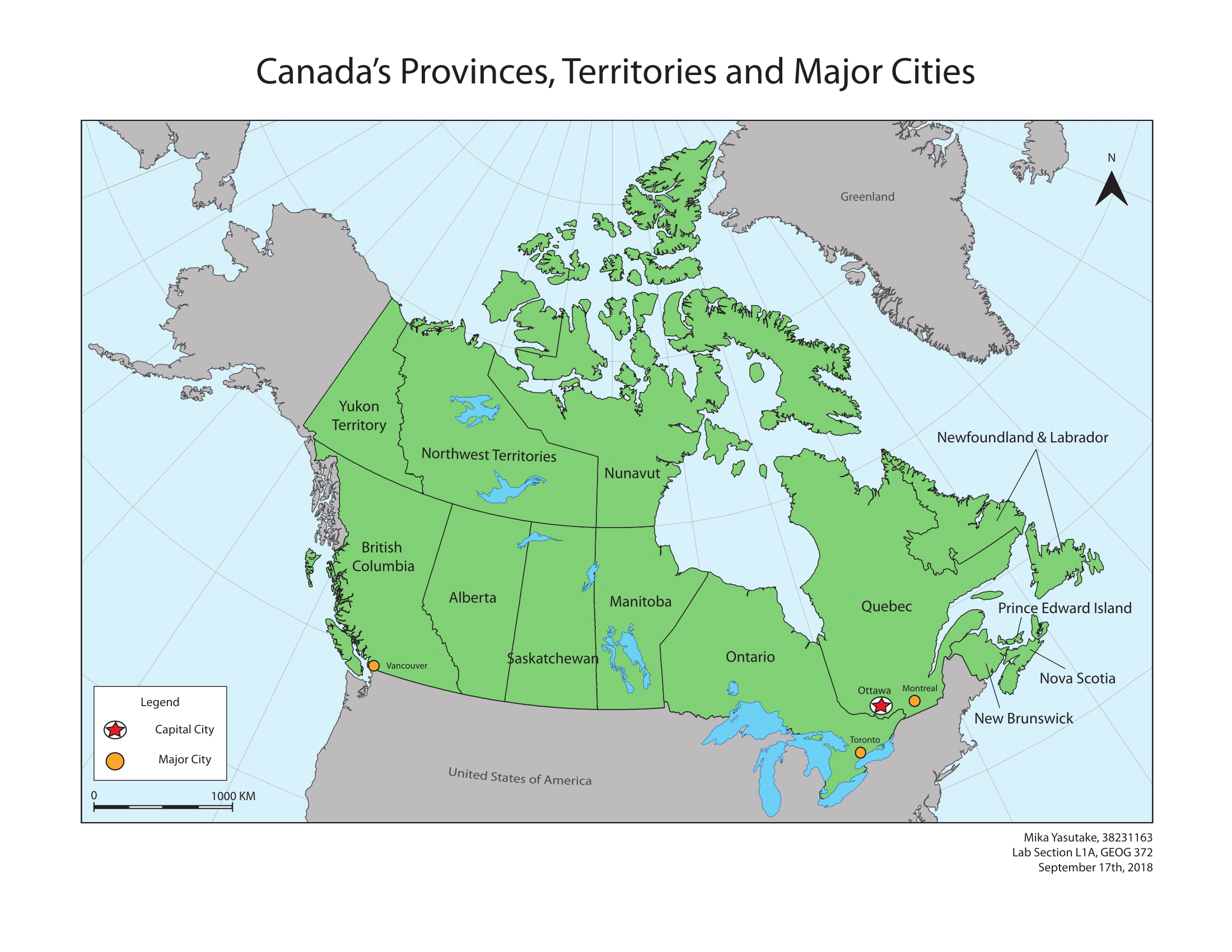
For my second week of Cartography, I have been tasked to create a coloured reference map of Canada's provinces, territories, and major cities, to be used in a high school social studies textbook.
In the past two weeks, I have learnt about different map types, data types, symbology and lettering. However, an underlying lesson among all these different topics was how the principle of visual hierarchy can be influenced by or affect these factors.
Visual Hierarchy
Visual Hierarchy is the presentation of map elements with which importance or order is implied. Cartographers are constantly striving to achieve effective visual hierarchies so that a map user's attention is naturally drawn to elements in order of their significance. This can be done by organizing features using their size, colour, form and positioning. For example, by using type size, I can highlight the order of places in BC based on their population.
Vancouver
Kelowna
Prince George
Nelson
Rossland
Other elements such as colour can be used, to differentiate elements of attention or conversely, to detract the attention from elements outside of a subject area. For example, Victoria could be sized the same way as Prince George due to its relatively similar population size, however could be coloured red to differentiate it as a capital city of BC.
HERE ARE SOME SKILLS AND LESSONS I'VE GAINED ALONG THE WAY:
- Created a reference map of Canada's provinces, territories, and major cities using Adobe Illustrator
- Surrounding geographical features can be labelled to give spatial context but must be placed lower on visual hierarchy
- North arrow must point in line with the graticules - top of the page isn't always north!
- Created leader lines for labels to avoid congestion of map elements
- Created an appropriate symbol to differentiate the capital from other major cities
As I continue to make maps, I have also learnt that it is always important to keep your audience and purpose in mind!