Vancouver - a liveable city, but for who?
Vancouver is among the top-ranked liveable cities in the world with incredibly accessible nature and temperate climates, as well as a diverse and friendly culture. Ironically, however, it is also one of the least affordable cities in the world, leaving us with the question of, "Who exactly is Vancouver liveable for?".
(UN)Affordability
Affordability can often be measured by comparing the median values of home sale prices and family incomes, giving Vancouver a median multiple of roughly 12.6 in 2018. As a millennial myself, I've long lost the hope of becoming a homeowner in my beloved city (unless I win the lottery, of course). This impossible catch-up game of median incomes and housing costs is likely to transform the demographics of the Vancouver I once knew, into something completely different.
Reporting Vancouver's Housing Issue
The scenario that I have been given is this: I am a data journalist currently employed by the Globe and Mail - Canada’s national newspaper. I need to compile some publishable maps to accompany an article on the cost of housing in Metro Vancouver, and how this has changed over the last 5 years, from 2011 to 2016. In this assignment, I explored different resolutions of census tracts (CT's) and dissemination areas (DA's), as well as different classification methods when displaying data.
HERE ARE SOME TASKS/SKILLS I PERFORMED:
- Acquired Canadian census spatial and tabular data for two different time frames to conduct comparative spatial analyses
- Conducted spatial joins to join tabular data with map files to eliminate redundancy and enable data investigation and modelling
- Analyzed data at different resolutions (i.e., CT's and DA's) to understand the pro's and con's for analyses of different scales
- Visualized housing data at different time frames and classifications to identify changes and patterns, as well as ethical implications of data reporting
- Investigated the terms of Census data collection to understand the context

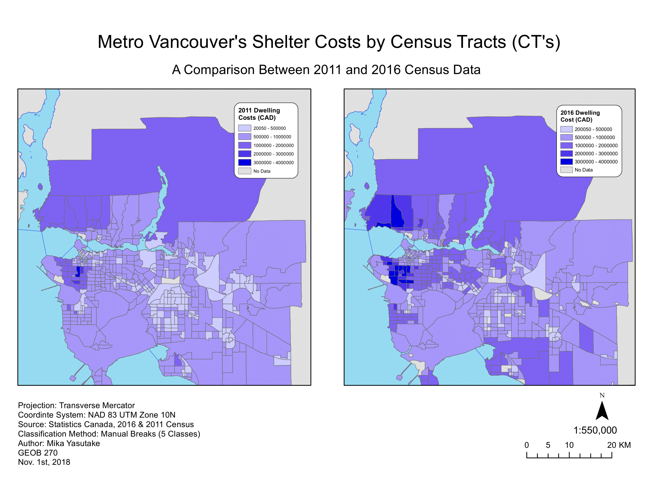
In the above map, I have compared the housing costs of Metro Vancouver across the temporal frames of 2011 and 2016. Both were classified using the manual breaks method to enable comparability. From this map, it was found that increases in housing costs can be found across Greater Vancouver, but more predominantly in areas such as the City of Vancouver, Burnaby, West Vancouver, Tsawwassen and White Rock.
Median vs. Average
I've always understood the difference between median and average values, but what I have come to learn is the significant difference between these two when reporting data. In this scenario, it is better to use median values because averages can be skewed or modified due to outliers or extreme values while median values are less susceptible to these inputs.
MODIFIABLE AREAL UNIT PROBLEM (MAUP)
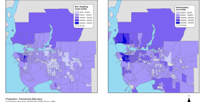
MAUP, or the modifiable area unit problem, is the error or uncertainty that arises from data suppression or data generalizations of an area, giving one value to represent all points of a variable within an area. This can be seen in the above map where grey zones, or no data areas, exist. This is an example of MAUP, where it looks as though there are no shelters within those areas due to data suppression, when reality tells a different story. Another example of MAUP would be how the estates and mansions in Shaughnessy - one of the most affluent neighbourhoods in all of Greater Vancouver - can skew the housing costs of condos of the neighbourhood when data is generalized over an area.

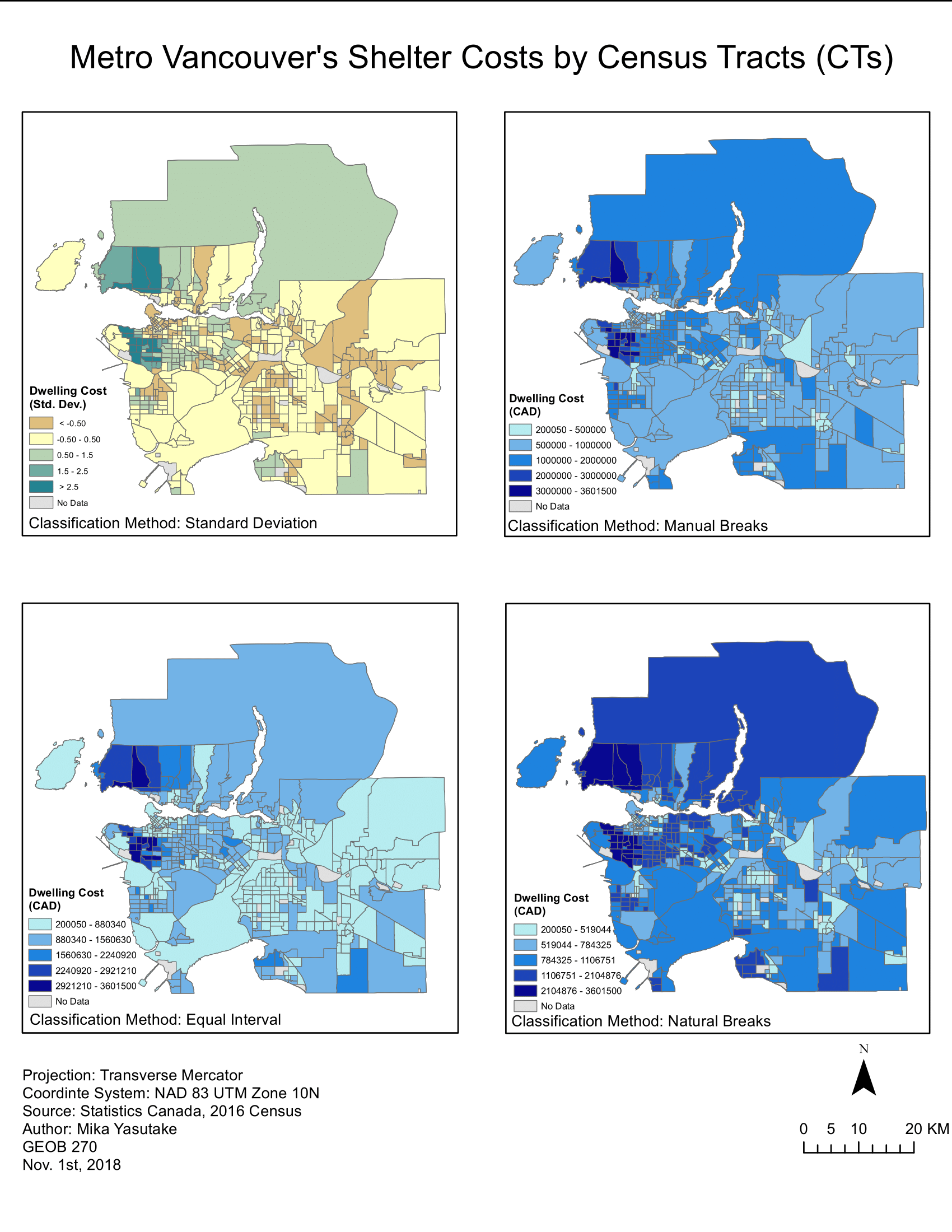
I've created this map to display the 2016 housing costs of Greater Vancouver using four different classification methods: natural breaks (jenks), manual breaks, equal interval, standard deviation. The comparisons of these maps showcase how the same data can be represented in different ways, giving different impressions while creating contrasting narratives. For example, the equal interval map makes areas other than West Vancouver and Shaughnessy seem relatively affordable, while the natural breaks classification method tells a story that is more true, highlighting ethical implications of data dissemination. When choosing a classification method, it is important to consider data distribution, the map's intended audience and purpose, while keeping in mind that there is no single "best" method.

This assignment has exposed and highlighted the following within my learning trajectory:
- effects and ethical implications of classifications when representing data
- legend values and classification methods as potential difficulties for map user's interpretations
- difference of median and average values when understanding and representing data